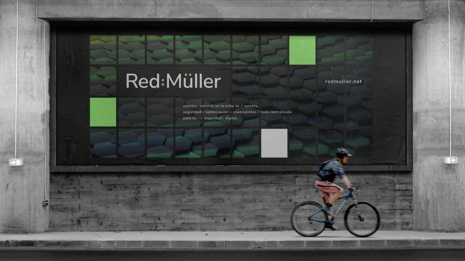
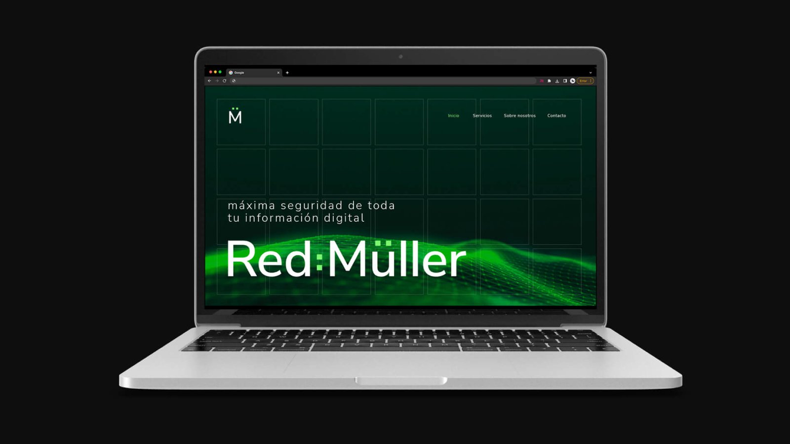
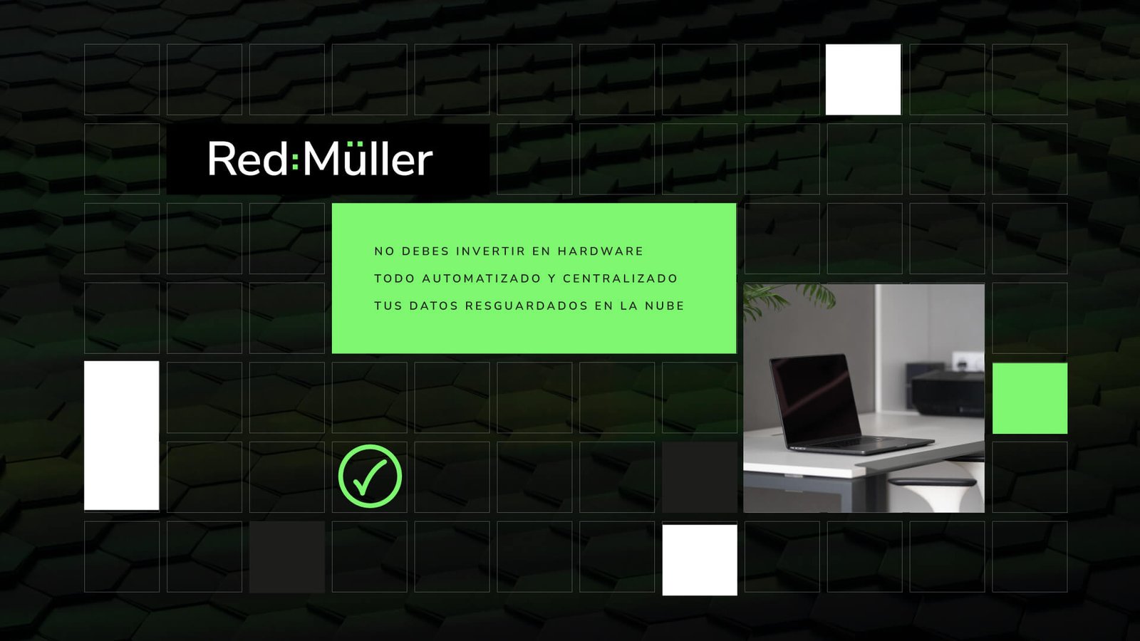
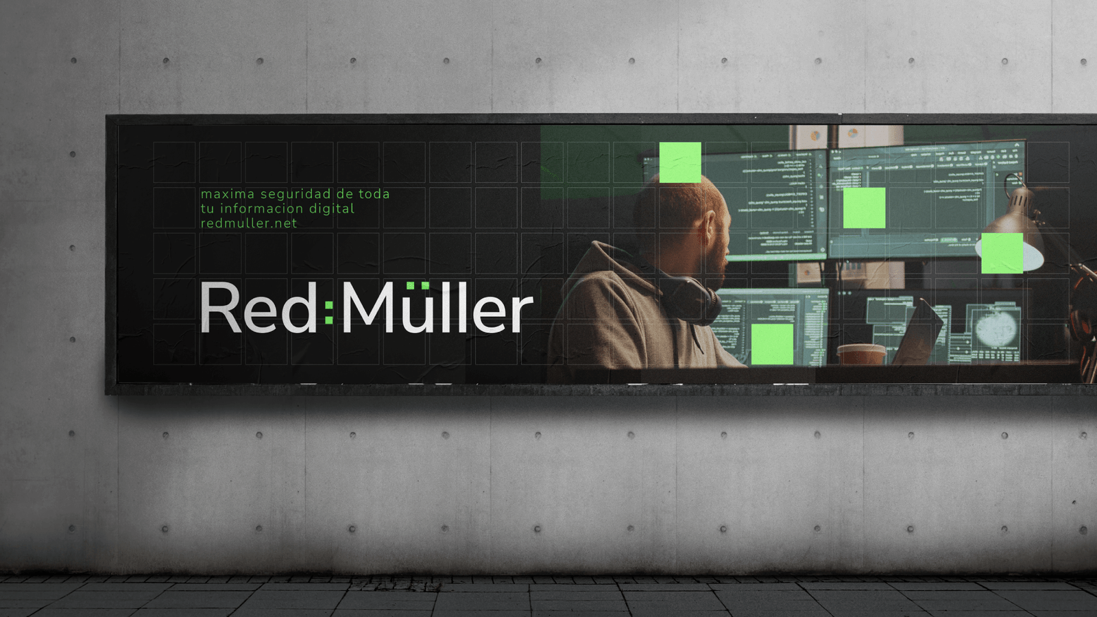
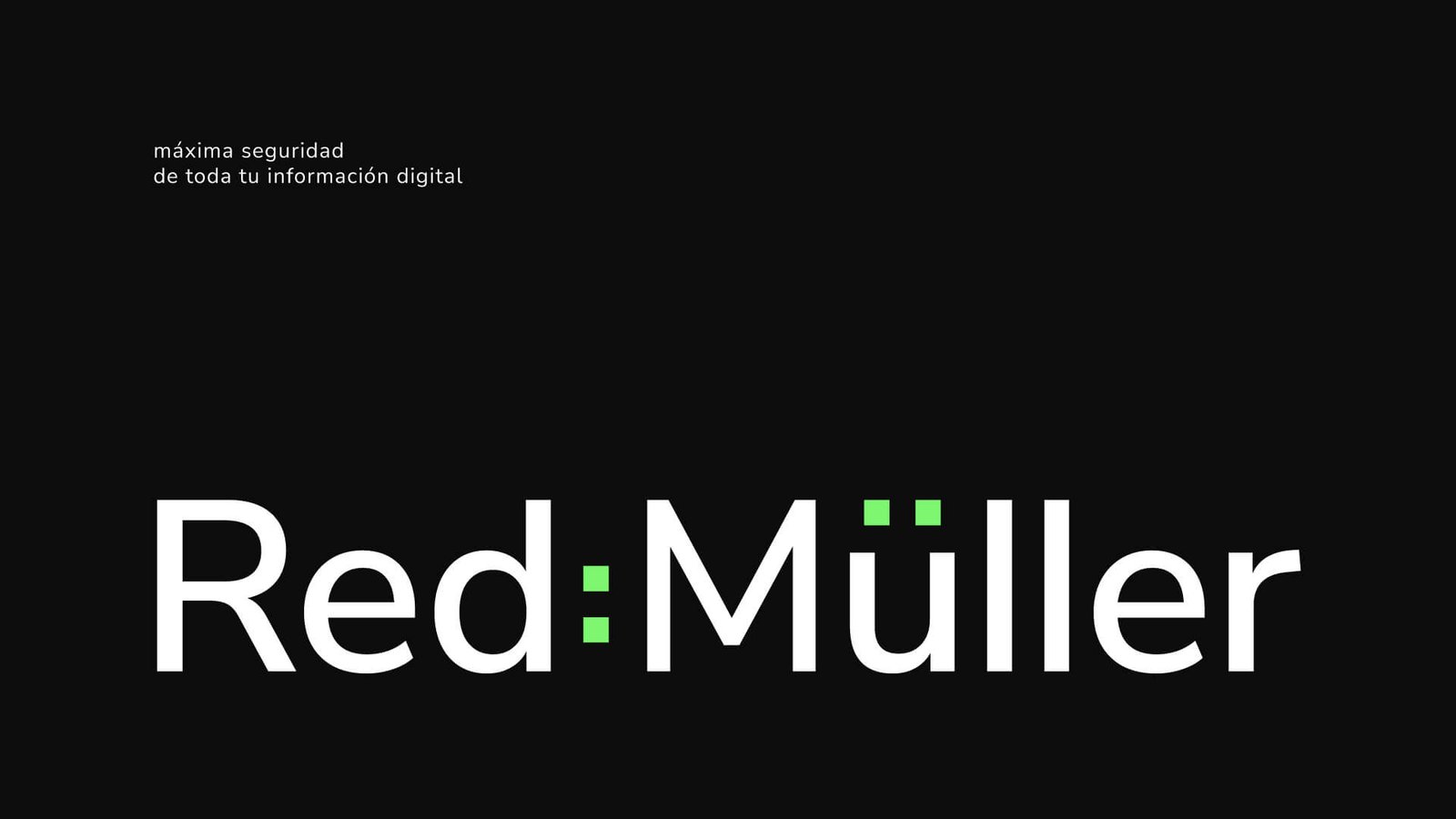
Red Müller
Digital information security company in need of an impactful identity.
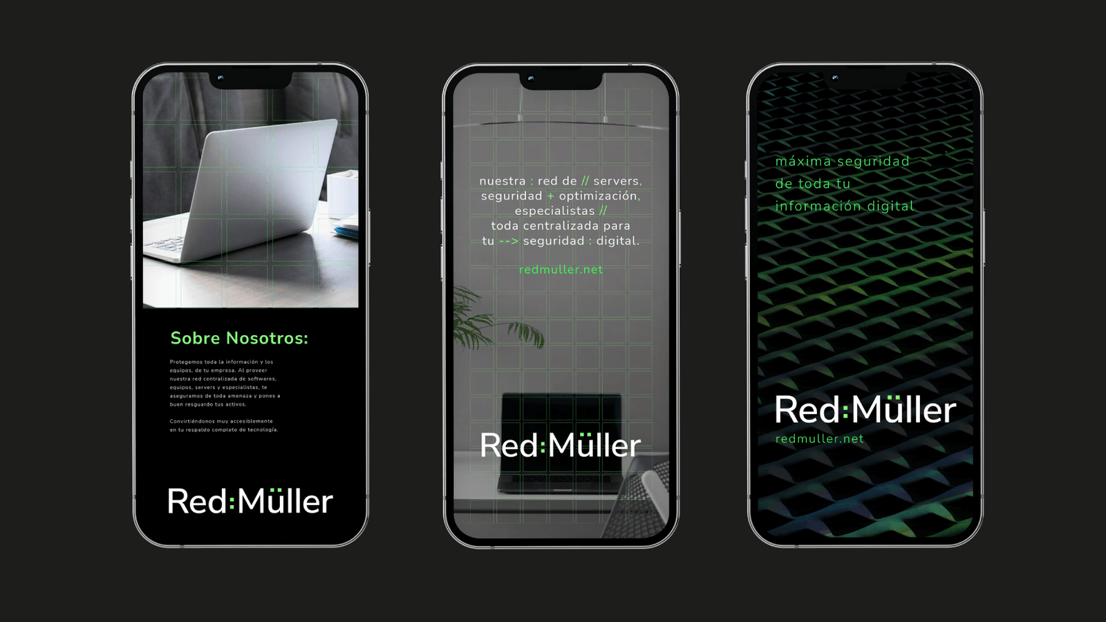
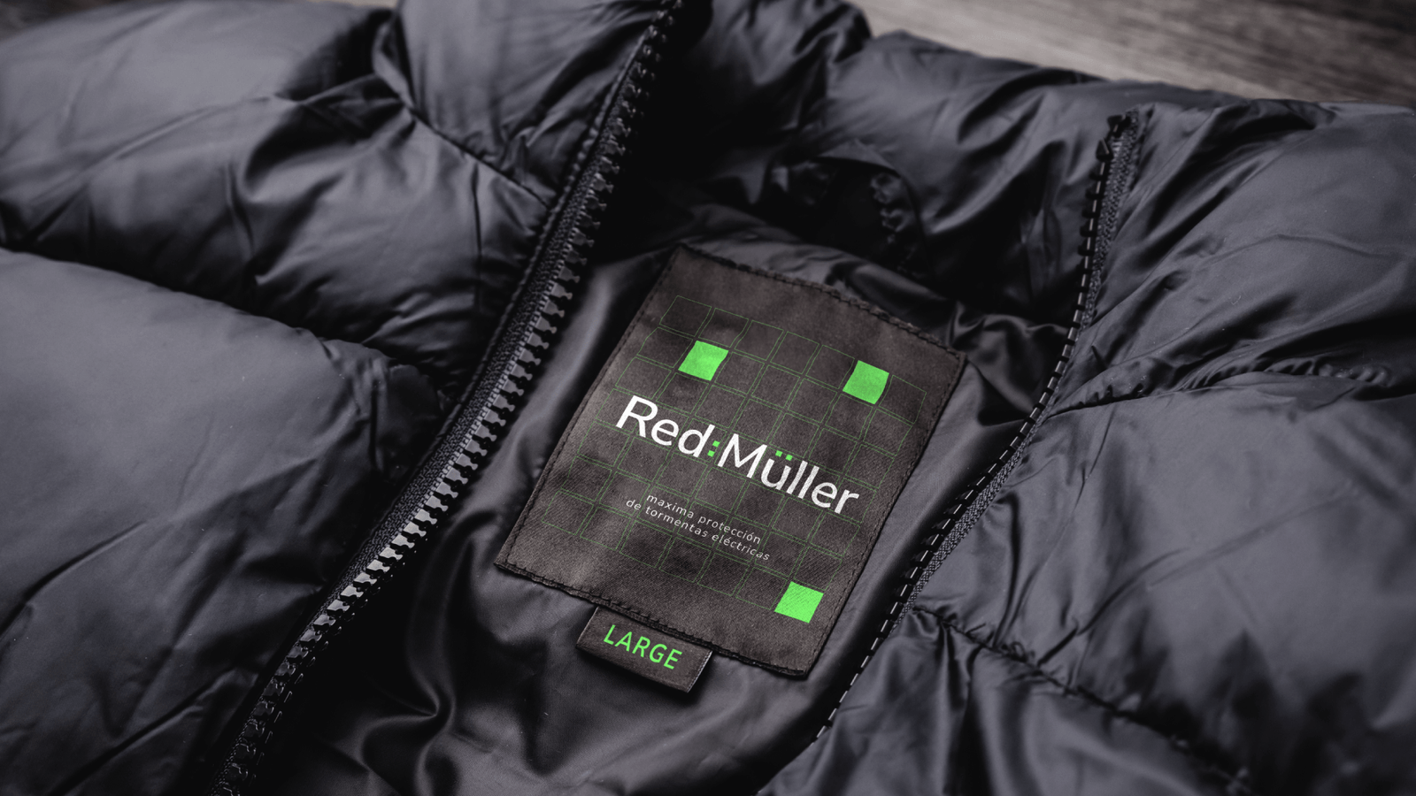
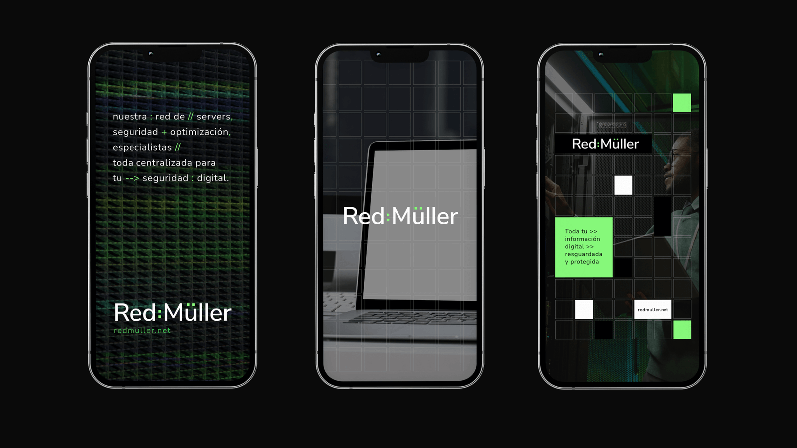
We created the entire branding concept based on a "red" meaning network in spanish. Inspired on the two dots above the U in Müller, the squares became the entire graphic resource for grids, modules, blocks and all elements resulting on the main structure of this digital visual world .
www.redmuller.net
Complete visual identity by: Mike Sierra